
Prototyping Lead – conceptualization, user research, field observation, kiosk design (physical + digital), wireframing, low-fidelity and high-fidelity prototyping, branding
Created for DSGN 100, the Relief Hub is a conceptual first-aid kiosk designed to provide rapid, self-guided care in crowded entertainment venues. Our solution streamlines symptom-based support through a digital Figma prototype paired with a mockup physical kiosk model. Built after extensive user interviews, field observations, and iterative testing, the design addresses long wait times, lack of knowledge in first aid, and confusion during urgent situations. Relief Hub empowers users to quickly locate, understand, and use medical products—without needing expert assistance.
Our secondary research revealed the significant health risks associated with entertainment venues. Over a 10-year period, nearly 70,000 people were seriously injured and 232 died at approximately 300 outdoor music festivals. Additionally, around 60% of festival-goers reported consuming drugs or alcohol, with alarming findings that 6 in 10 fentanyl-laced pills contain a potentially lethal dose. These numbers highlight the urgency of accessible, on-site medical support.
To better understand the user perspective, we created detailed personas and storyboards illustrating common scenarios—such as dehydration, minor injuries, or confusion during medical emergencies. We then conducted 5 interviews focusing on users’ first-hand experiences and their reactions to the storyboarded situations.


Through affinity mapping, we uncovered several key insights:
There is currently not an efficient system to get quick medical aid at entertainment venues.
Our mission is to enhance safety and reduce urgent medical incidents by creating a system for easy access to rapid assistance, to ensure a more safe and enjoyable experience for all entertainment venue goers.
How might we create a more efficient system for receiving medical aid at entertainment events?


Our research findings identified a need for a solution that offers quick, autonomous access to essential medical resources. To address this, we proposed implementing a self-service kiosk system.
Self-service kiosks have been shown to significantly enhance efficiency and speed for straightforward tasks, particularly when individuals are aware of their specific needs. For instance, a study by American Express found that 60% of customers opt for self-service tools for simple tasks over talking to live representatives. Additionally, research indicates that kiosks can reduce customer wait times by as much as 40%, allowing users to complete their transactions quickly and efficiently.
By implementing a kiosk solution, Relief Hub empowers individuals to access first aid resources promptly and autonomously, reducing wait times and alleviating pressure on event staff. This approach not only streamlines the process of obtaining necessary assistance but also aligns with the growing consumer preference for self-service options in high-traffic environments.

Due to logistical limitations, we selected Petco Park, a major sports stadium, as our observational site. Though not a music festival venue, it mirrors many conditions we were designing for: large crowds, high foot traffic, noise, and long walking distances. Our goal was to understand how physical constraints, traffic flow, and environment could affect kiosk usability and placement.
We identified several strategic placement zones for the kiosk:

Using insights from fieldwork and user needs, we created early physical sketches to explore the kiosk’s form and features. Our focus was on clarity, safety, and minimal friction, especially in stressful scenarios. Key ideas included:
These sketches informed the final design of both our Figma digital prototype and full-scale physical kiosk, which together demonstrate how users would locate, navigate, and receive help through the system.
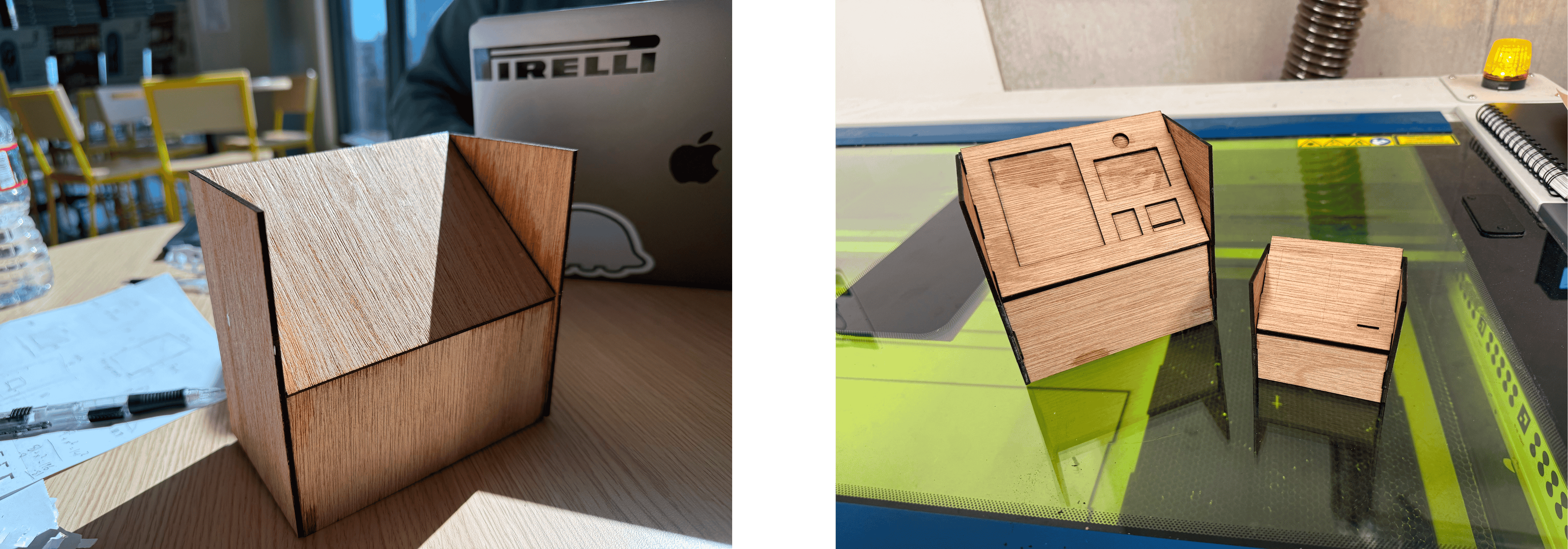

To prepare for final fabrication, we first created several small-scale material test prototypes. These mini models helped us evaluate laser cutting precision, joint measurements, and material durability before committing to a full build.
Due to material and space limitations, we were restricted from constructing the entire kiosk structure. Instead, we focused on building the key interaction areas — including the touchscreen zone, item dispenser slots, and payment section — ensuring that all critical user-facing features were represented.
The full-size prototype was made using plywood. Due to limited resources, we wrapped the structure in thick paper stock to mimic the appearance of a polished metal kiosk. An iPad was installed in the screen area to simulate the touchscreen interface during demonstrations.
This approach allowed us to test the kiosk’s physical usability, accessibility, and user flow within realistic constraints.

To structure the user experience for Relief Hub, we developed a low-fidelity flowchart outlining the kiosk’s main interaction paths. Our goal was to design a process that supported both quick item searches and guided help through symptom checking, while prioritizing emergency escalation when necessary.
Two main user flows for finding items:
Checking Out


We conducted a feedback session with four interview participants using our low-fidelity (lo-fi) prototype. Each participant was given two tasks: one using the search flow to locate a specific item, and one using the questionnaire flow to receive product recommendations based on symptoms. We found that:
Based on feedback from user testing, we made several key refinements to improve clarity, usability, and emergency response within the kiosk interface:


